

Redesigning the Amazon Ads website
Senior UX Designer
2017-2019
Led the redesign of the multimillion-dollar Amazon Advertising website, which generated a 128% increase in global revenue year-over-year and a 2.4% increase in advertiser registration.
Context
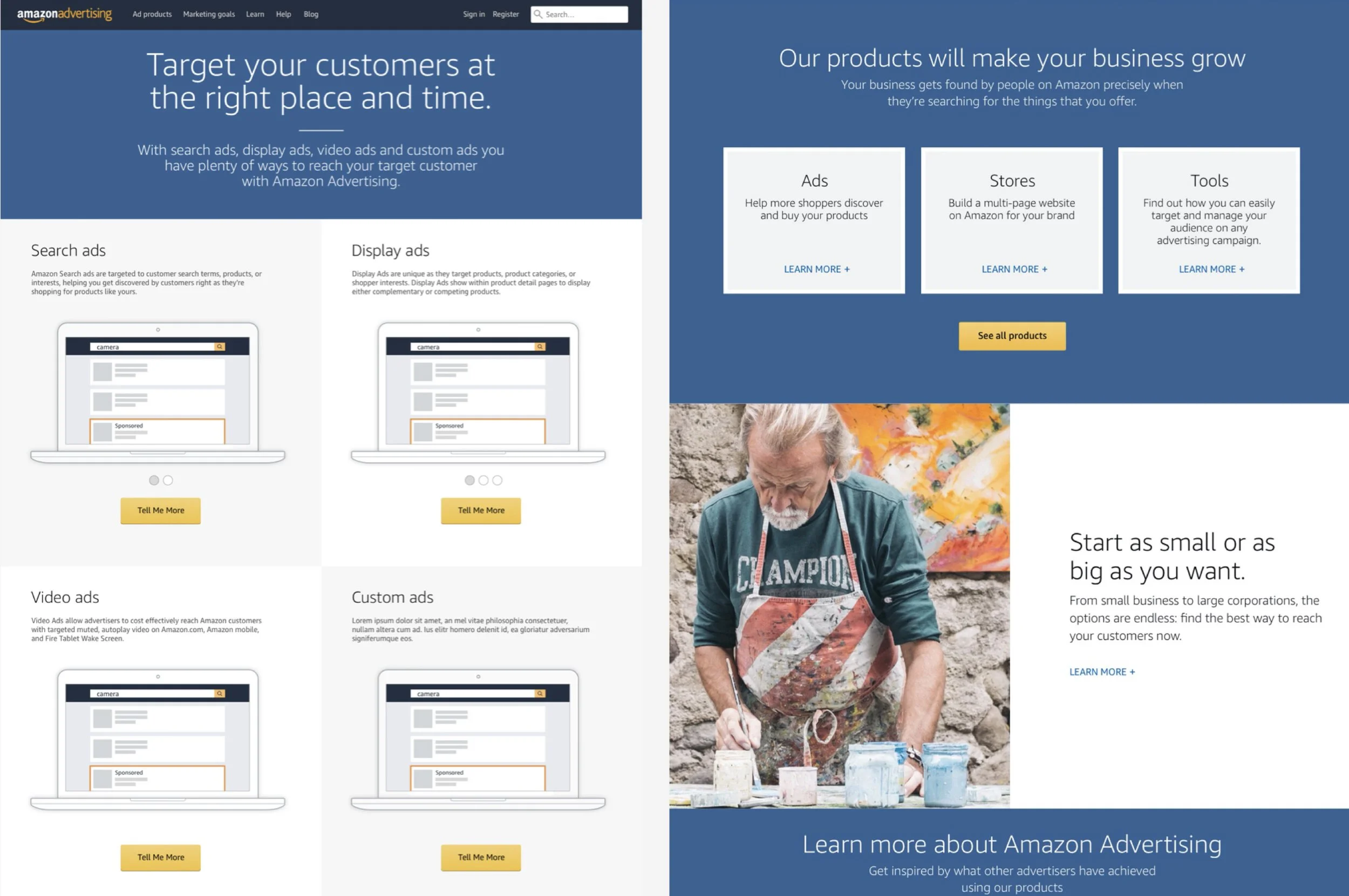
Amazon Advertising had a poor online presence in 2017: its ad offerings were presented inconsistently across multiple portals, the content was outdated and displayed inefficiently, and managing content in an antiquated CMS was incredibly cumbersome and time-consuming.
Because the business recognized that the website needed a complete overhaul, it funded a brand-new project aimed at rebuilding its online experience, which I led from the design side.
Role
My primary responsibility as part of a larger UX team of roughly 30 individuals at the time was to lead the design of a central hub for all advertising products by optimizing content for an awareness-to-acquisition experience. A new CMS would also be used to create material, allowing editors to manage their content more efficiently and with an easy-to-use interface.
Leading discovery
We began the project by evaluating data on the already-established personas for the Advertising business and outlining the website content that needed to be streamlined. This resulted in many alignment meetings with internal stakeholders and a card sorting exercise with a few users, all of which contributed to the initial design of the website's information architecture.

Content is still king
Reorganizing and optimizing the website's content was one of the primary motivations behind the redesign. The team devoted a significant amount of time to comprehending customer requirements, and Research conducted a few comprehension testing sessions to ensure that material could be easily comprehended by the average user regardless of the user interface.

Content-driven design
The results of the content research had a significant impact on the path that the team chose to take as well as the way that we arranged information across the website. The team experimented with a variety of different layouts and ideas, initially doing so in a low-fidelity format in order to move more quickly and reach consensus on the broad direction before transitioning to a high-fidelity format.


Building the experience on a brand-new CMS
A significant portion of the project consisted of migrating the website and all of its content to a brand-new Amazon WYSIWYG content management system (CMS). The goal was to provide editors with access to a more up-to-date and responsive tool that would allow them to edit and submit new content while simultaneously saving valuable time and effort.
Measuring the impact
The website, which has more than 250 pages, was opened to the public for the first time in January 2019, and it was made available in 11 different geographic locations and 8 different languages. Within the first six months of the product's release, we were able to assess our impact in a quantitative manner as well as receive overwhelmingly positive feedback from users and stakeholders alike.
Registrations
+2.4%
Exits from detail pages
-1.3%
Ads launched after registration
+2.1%
This project's detailed case study is available offline.
Please contact me if you would like to see my full portfolio.